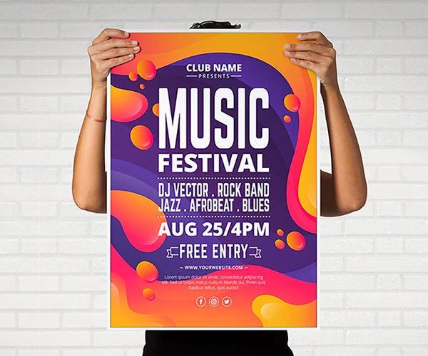
A poster's details include a central title, supporting body text or graphics, eye-catching imagery, and a clear call to action. Effective posters have an organized layout with ample white space, use consistent typography, and include brand elements and contact information. Key components like the headline, visuals, and text work together to create a concise and readable message that grabs attention. Key components of a poster Title: A catchy and conceptual title that is short and highlights the core content. Headline: The main heading to grab the viewer's attention. Body Text: Concise and simple language to provide key information without overwhelming the viewer. Imagery and Graphics: Visual elements like pictures, charts, and graphs that convey information clearly. Layout and Design: An organized and balanced arrangement of all elements, including headings and text, often using vertical columns or contrasting fields. White Space: Ample space around elements to prevent a cluttered look and improve readability. Typography: Limit fonts to two or three types and use a legible font size for all text, with large sizes for titles and headings. Color Combination: A palette that is visually appealing and easy to read without low-contrast colors. Brand Elements: Logos or other elements that are relevant to the organization or product being promoted. Contact Information/Call to Action: Details on how to get in touch or what the viewer should do next, such as visiting a website or attending an event. Tips for an effective poster Be concise: Avoid overloading the poster with too much information or text. Be visual: Use graphics and images to help tell the story and make the poster more eye-catching. Organize logically: Break down content into clear sections with headings to guide the reader. Use high-quality visuals: Ensure any images are high-resolution and that text is easy to read from a distance. Proofread carefully: Check for any spelling or grammatical errors before printing.


